
Cart
0
your cart
No items found.
Product is not available in this quantity.
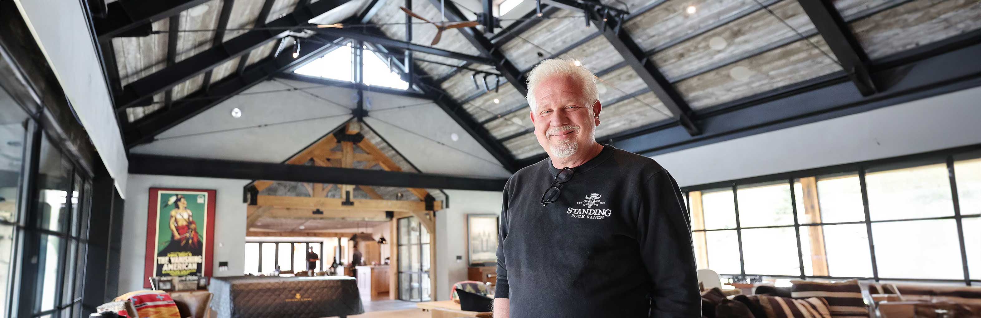
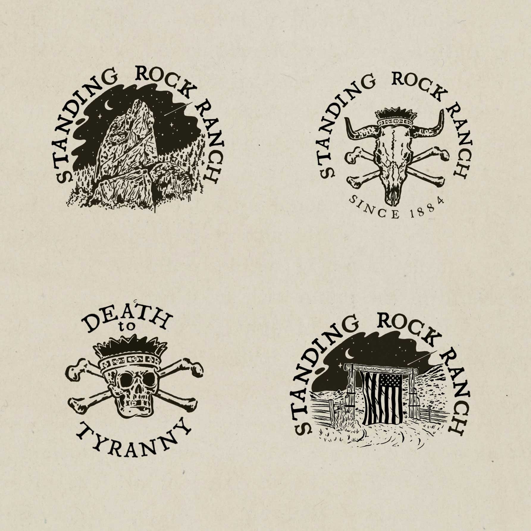
Standing Rock Ranch approached me to develop a visual identity that captured the rugged authenticity of the American West while still feeling timeless and refined. The ranch has deep historical roots dating back to the late 1800s, and the goal of the project was to create a brand system that honored that heritage while giving the ranch a cohesive and recognizable identity across merchandise, signage, and print materials.The design direction draws heavily from traditional ranch iconography, vintage livestock brands, and hand-crafted western illustration styles. Rather than creating a single mark, I developed a small system of marks that could be used across different contexts while maintaining a consistent visual voice. Each mark was designed to feel as though it could have existed historically while still functioning in modern applications.
Brand
Logo identity
Illustrations
lettering
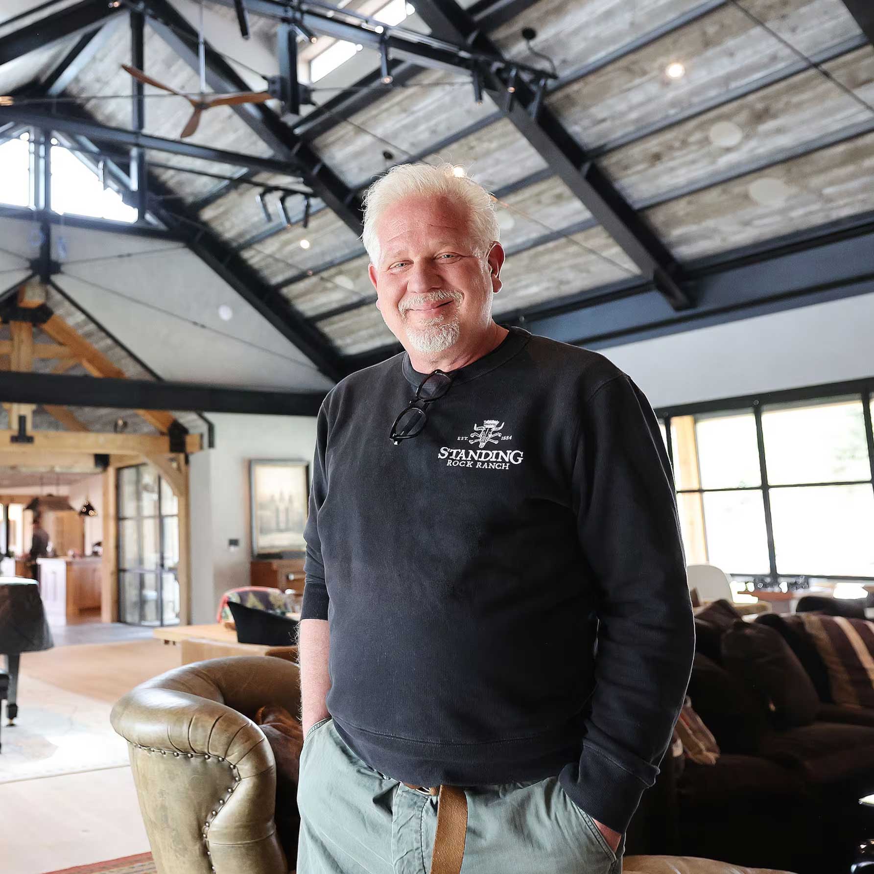
Photography by: Jeffrey D. Allred, Deseret News
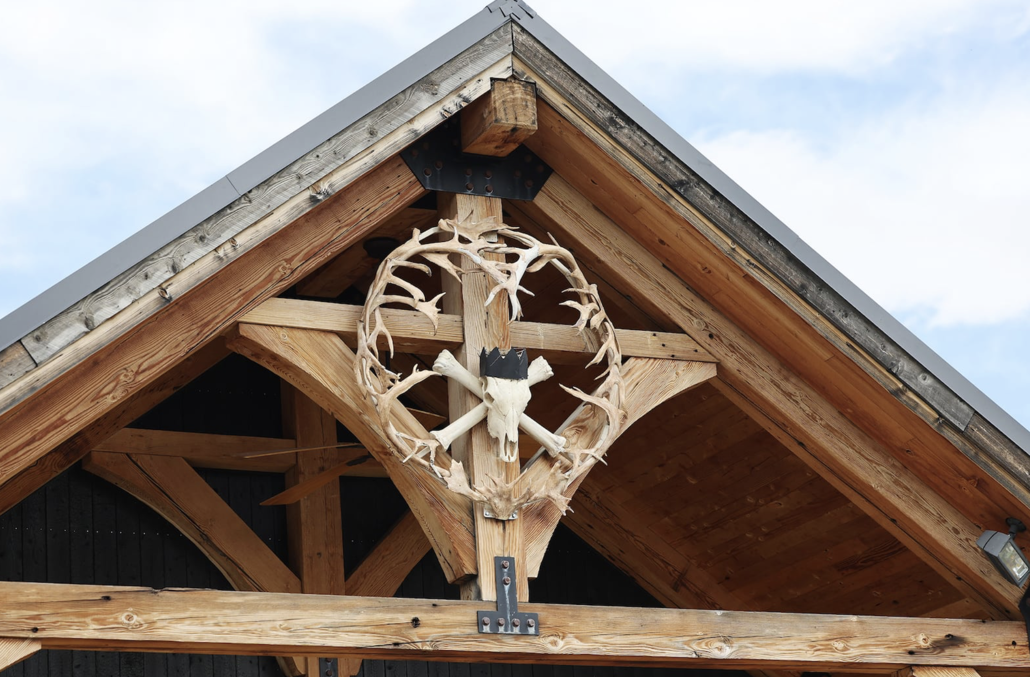
The visual language of the brand was built around the idea of heritage and permanence. I explored forms commonly associated with western ranch culture such as cattle skulls, rock formations, ranch gates, and natural landscapes. These symbols are deeply tied to the story of the American West and helped ground the identity in an authentic visual narrative. To reinforce the sense of craftsmanship, the marks were illustrated using a hand-drawn technique that references vintage stamp graphics and historical livestock brands. The imperfections in the linework were intentionally preserved to create a tactile and human quality, reinforcing the idea that the ranch and its story were built over generations.Typography was kept simple and traditional to complement the illustration work. The lettering was designed to feel bold, legible, and rooted in classic western signage.
All of the artwork was illustrated by hand before being digitized and refined. This process allowed the marks to maintain the organic character typically found in traditional ranch branding and vintage western graphics.Texture and line weight were carefully balanced to ensure the logos would reproduce well across a wide range of applications—from embroidered apparel to signage and print materials. The goal was to create marks that feel equally authentic whether stamped onto leather, printed on packaging, or displayed on large-scale ranch signage.The final result is a brand identity that reflects both the history of the ranch and the enduring spirit of the American West.

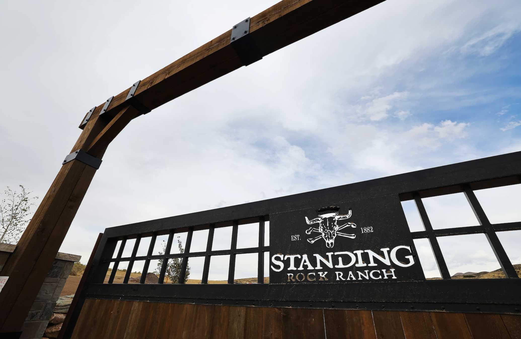
The final identity provides Standing Rock Ranch with a cohesive visual system that can be used across a variety of brand touchpoints. From apparel and merchandise to signage and digital applications, the marks maintain a strong presence while preserving the handcrafted aesthetic that defines the ranch’s character.By combining traditional western symbolism with thoughtful illustration and typography, the brand now communicates a sense of heritage, authenticity, and pride in craftsmanship—values that are deeply aligned with the story of Standing Rock Ranch.


